Graphic Designer

Sedate is a photography book that introduces Iceland. The concept is to shows the readers what slow travel means and the lifestyle in Reykjavik, the capital of Iceland. The design of the book was inspired by the ambience of Reykjavik. Each of the chapters comes with a series of photos for the readers to experience how to travel unhurriedly.
The layout was designed in a fair amount of white space along with a minimal content and every image was chosen to correspond to the atmosphere in Reykjavik.
For typography, I chose Gold bold as headline, which is in upper case with clean and narrow stroke. As I would like to keep the images stand out. On the other hand, I chose Tall Films Expanded for the body text, which are in clean and small stroke.
Pure is a luxurious Condo development in a neighborhood of downtown Sydney, Australia. The word “Pure” indicates that the design of the condo is elegant and comfortable. This brochure allows readers to experience the traits of the features, interior, and the convenient amenities of the condo.
The color palette was chosen to express the calmness and create a delightful ambiance to the readers while the images were chosen categorically as each article describes the different aspects of Pure. The simple layout of the business card and images highlights the features of Pure.
For typography, I chose Dolce Vita as title, it’s a sans serif and all capital which is stylish and elegant, as it aligns with the simplicity of the building. The Minion Variavble Concept fonts is a serif font, which offers various of thickness and coordinate with the images.
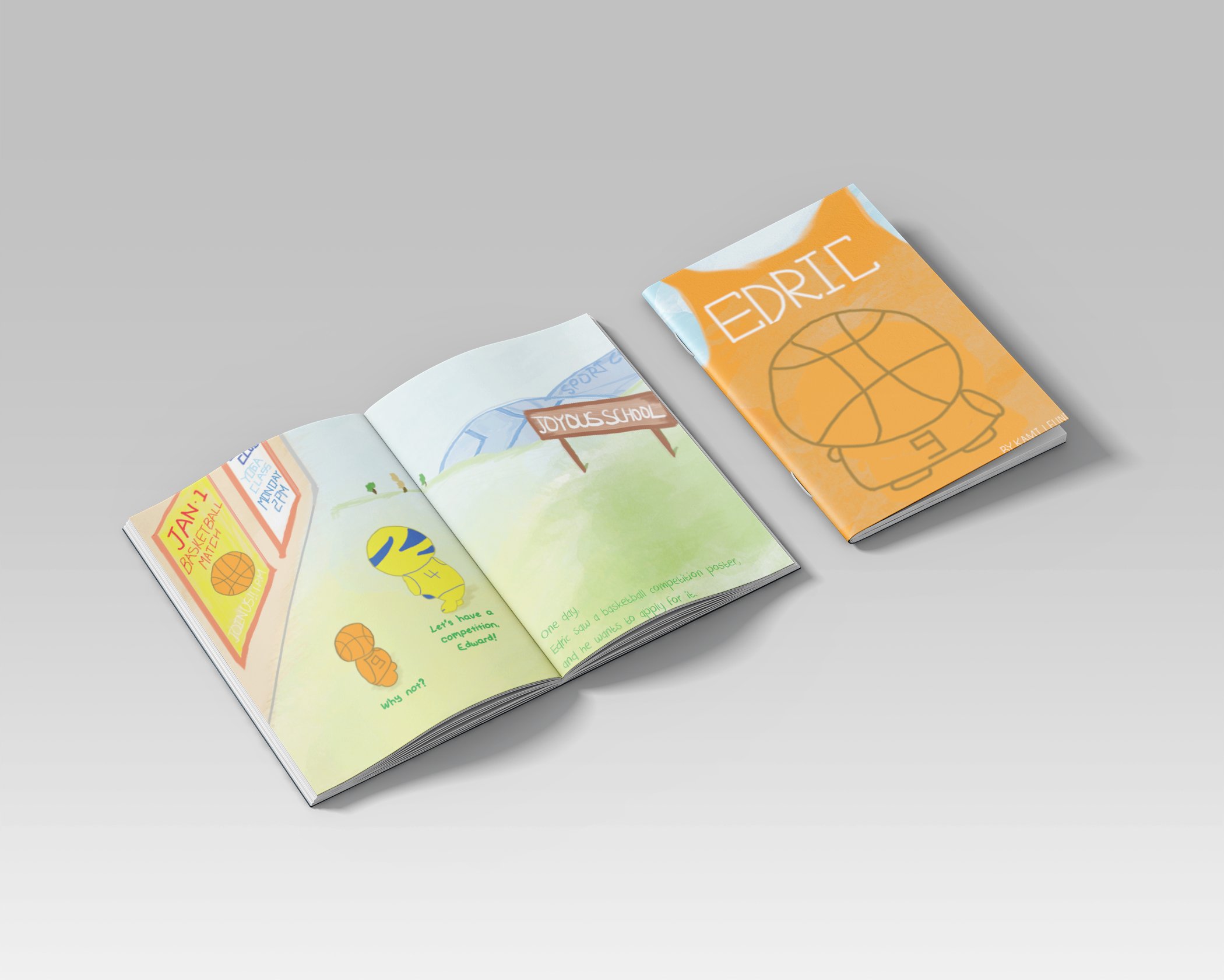
Edric is a children’s book using sport to illustrate the characters. And they are all unique, which represents different personalities. The goal is to inspire children to be fearless and confident. The story describes a character being afraid to achieve his goal as he always compares himself with his peers. However, he accomplished his goal in the end.
In order to assist the children to be passionate about art, the drawing is in colorful printing with simple lines. Each of the characters are in different body gestures with unique outfits which corresponds to their behavior and personality.
For typography, I chose a handwriting font called “DK Crayon Crumble” along the energetic illustrations is meant to convey an enjoyable feeling to the readers, while the irregular layout of the content added amusement for the children to read it. On the other hand, I also chose the font called “Those_Days” for the dialog, which in thicker stoke and emphasis the conversation.
Capture is a branding project for the 2015 Vancouver Photography festival. The goal is to develop the concept of the festival for the community through a set of posters, bookmarks, coasters, and tickets.
I picked one of the popular attractions in Vancouver as background image. The stationery set is in clean alignment along with the graphic arts that are from the exhibition. This branding project allows the audiences to explore the photography world. The color palette for the text is purely white as the artwork is bright and strong.
For typography, I chose Caviar Dreams for the main title, which comes with a thick stroke that can emphasis the contrast of picture and the text. For the body text, I chose Biko which comes with round corner and coordinate with the graphic arts.
Cowboy is a conceptual playing card project. The design is based on the history of the American cowboys of the late 19th century and each of the cards represent different personalities of each character.
The design of the character outfits utilizes various color palettes to symbolize the style of cowboy, while the vintage pattern on the back of the card is based on the Wild West culture. The layout of the playing cards is consistent with the symbols to entertain the players, also inspired from the historic cowboy culture.
For typography, I chose Fred Wild West as the playing card symbols, this font combined with pattern which brings the sense of the cowboy.
Sit & Sip is a design magazine that introduces the varieties of tea in the world. The name of the magazine “Sit & Sip” indicates the leisure of tea, and it demonstrates the best way to enjoy tea.
The contents of Sit & Sip included the brewing methods, timing tips, and the details of the source about the most common tea in the world. The color palettes were chosen to characterize the features of the tea along with the chosen pictures provide further clues to the readers. Sit & Sip is an informative design magazine emphasizing the value of tea.
For typography, I chose a font called Neou as for headline, it’s elegant with a clean stroke. Which stand out the topic of each page. For the body text, I chose Seravek Basic, which is tiny but effortless to read in a small paragraph.
This travel guide brochure is designed for who want to experience a short trip in Hong Kong. It shows the best places and the most important information that you would like to know before visiting. Each spread introduces a place with pictures and description. I designed it with the color of black and white as the picture is colorful enough.
For typography, I chose Butler family, it’s a serif font and offers clear stroke and easy to read. Also, I used AaWangCaiZhaoPaiTi for the Chinese characters as they bring the Hong Kong vibe to the brochure.
The City of Mystery is a rebranding project for Cappadocia, the city of Turkey. The concept of this project is to let the readers explore this mysterious and exotic city, especially those who are interested in geology.
The design of the logo symbolizes the iconic activities in Cappadocia, the color palettes of the icons indicate the geographical area though the year in the city. The icons represent the notable features of the neighborhoods and the culture. Each of the icons have a consistent background with white stroke, which standout the symbolic items in Turkey. The City of Mystery allows the readers to discover the other side of Cappadocia.
For typography, I chose a font called Homizio, which has an exotic vibe and stands out the mystery of Cappadocia.
Life of Pi is an ending credit video project. The goal of this video is to summarize the movie visually in one and half minutes. The series of motion graphics was done by illustration, and every illustrated scene is meant to represent the movie scene.
In order to deliver the message of the movie to the audiences in a short time, the design of the video includes diverse motion graphics with the opening credits that shown in order. While the font and the background music were chosen to corresponds the style of the movie which is about faith and encouragement.
Welcome to have a look at the link below!!